Achieving Excellence in SaaS Web Design: Best Practices


When discussing web design for SaaS, marketers often rely on established standards and best practices to optimize website performance and attract more visitors. Prioritizing user comfort and preventing eye fatigue is crucial, as potential clients quickly decide whether to stay or leave within seconds. You only have a brief window of time to capture their interest. Additionally, SaaS web design determines how much time visitors spend on the website and how deeply they engage with its content. It is also important to ensure that the style of the website aligns with the brand’s concept, values, and philosophy.
Failing to capture visitors’ attention or presenting a misleading style will likely lead them to return to the search results. This means missing out on the opportunity to showcase the value your SaaS offers to their businesses. Understanding the underlying significance of these principles and whom they ultimately serve is essential. It is the end users who hold the decision-making power. Therefore, all your efforts in directing traffic through various digital channels for startups might be in vain if you neglect the critical aspects of your SaaS website’s UI/UX. It’s time to dive in and make it count!
Here are some key considerations to keep in mind:
So, a SaaS startup website should be created with a user-centric approach in mind. And here are the tips we at Glorium Marketing recommend for SaaS web design.
Content
Placing the logo in the top left corner of a website is the most common practice. But why is this the case? The origin of this convention can be traced back to the era of slow dial-up connections when websites took considerable time to load. During that time, page elements loaded sequentially, starting from the top. Therefore, under such conditions, the first element that appeared was typically the logo. This established a pattern that has endured over time. While variations can be observed, such as the logo occasionally being centered at the top, the top left placement remains widely adopted.
 Also, text-dominant and horizontal-style logos for tech companies are preferable. Using a horizontal logo offers significant advantages in terms of design and functionality. By positioning the logo horizontally, website creators can optimize the user experience and avoid needing an excessively wide menu. Consider the scenario where a logo is square-shaped; adopting a vertical orientation would result in a less-than-ideal outcome. This design choice directly responds to the prevailing conditions, as users generally dislike encountering a massive header that consumes valuable screen real estate. This concern extends to mobile versions of websites as well. Even when scaling down the dimensions, incorporating a vertical logo would still claim a significant one-third portion of the limited space available. Hence, the horizontal logo placement emerges as a prudent solution, ensuring aesthetic appeal and efficient screen space utilization.
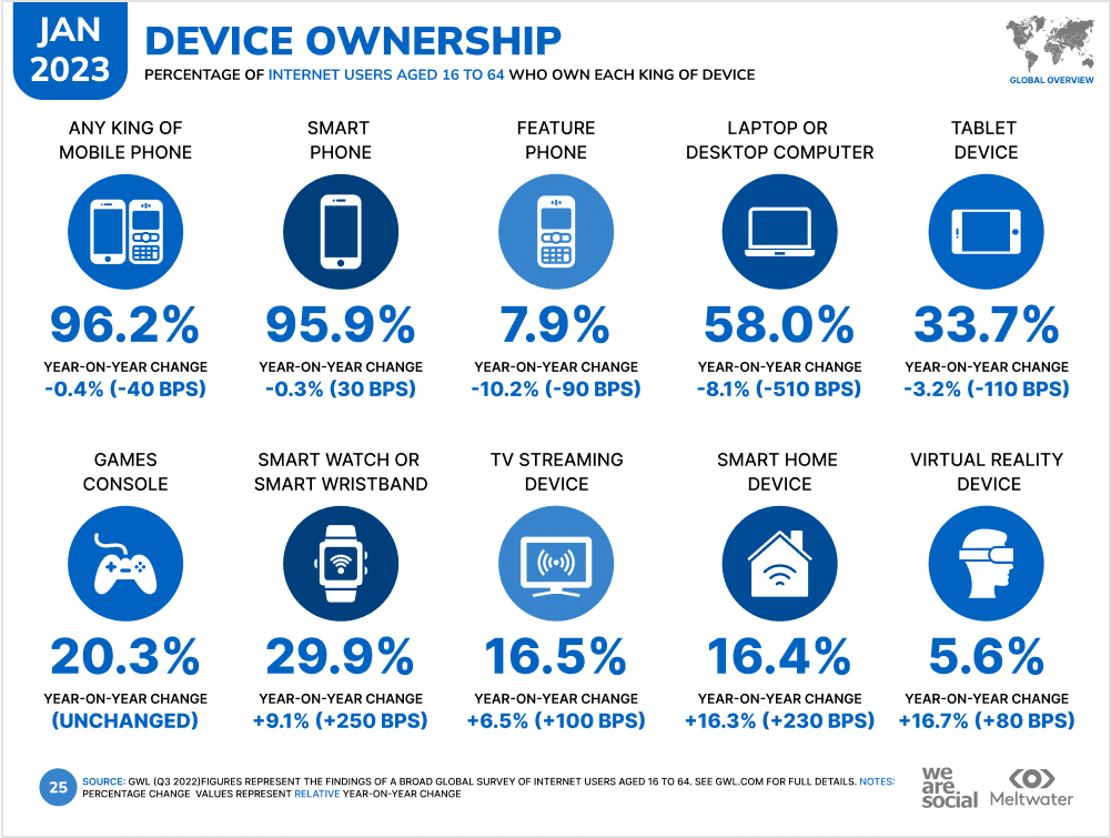 A recent study conducted by DataReportal found that 95.9% of the 5.16 billion internet users worldwide are using their smartphones to surf the web, while 33.7% prefer tablets for work. And the key takeaway here is to make your website mobile-responsive. Most SaaS companies are now prioritizing responsive SaaS web design and mobile landing page best practices rather than solely focusing on desktop users. This is a positive step towards creating a more accessible and user-friendly online experience.
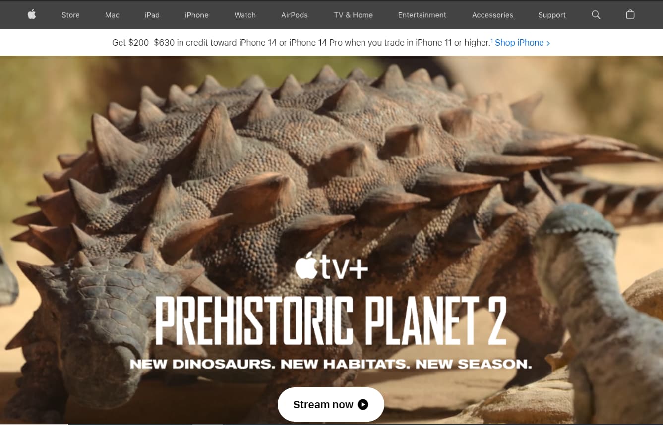 According to the Foundation Marketing research, around one-third of SaaS websites have videos. And they are surprised by that fact explaining it with some legacy issues. However, in practice, the need to place a video highly depends on industry specifics and company objectives. In other words, the tasks that must be accomplished are related to videos or the homepage. The issue is that many companies base their decisions on what their competitors have, assuming that if a competitor has something, they should have it too. This may appear counterproductive as competitors or, for example, well-known brands have their specifics, their positioning based on their own research and their users’ needs for SaaS web design.
So, a good example is showcasing an impressive video if you specialize in 3D or advertising, highlighting your latest hit on the homepage’s first screen. When people visit, they click, watch, find no questions, and it becomes very valuable to them. Another story is a scheduling app for HoReCa. Your potential clients will be interested in features and, primarily, in pricing options. So, again, make a data-driven decision based on your customer’s needs.
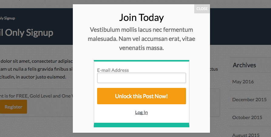 Do SaaS websites need popups? Some marketers say they do, others argue. To answer this question correctly, we should walk in our user’s shoes. Let us imagine you have some exciting content. It may be a service page where your potential clients find the information crucial to making purchase decisions or a blog post where you share your expertise. The visitor is reading, and suddenly your popup appears with an offer to sign up for newsletters or book a call. What does that person feel? We bet nothing but irritation and anger. So, is that popup doing a good job for you? Probably not.
So, what’s the solution? Not to use popups? Not exactly. Sometimes they are needed to ensure that your users agree with data privacy regulations and provide their consent for processing personal information. If talking about a commercial popup, it’s better to deploy it when your visitor scrolls the page down to the bottom, reads the content, and finds it interesting. And here you can offer more! That’s a good step in SaaS web design.
 Do not make your users think too much. They are busy and only have a little time to spend. Think of them as valuable guests coming to your website with a clear intentions. They are not just “users” but individuals seeking information, requesting services, signing up, or comparing products. Let’s ensure their experience is positive and they get the desired result. Providing them with too many options in your navigation menu will result in confusion and visitor churn.
Another option is a well-structured menu that can easily navigate your users through a solid number of services, benefits, case studies, demos, and whatever may bring value to them. Make their choice easier and let your website be a wonderful guide during your service “sightseeing” tour.
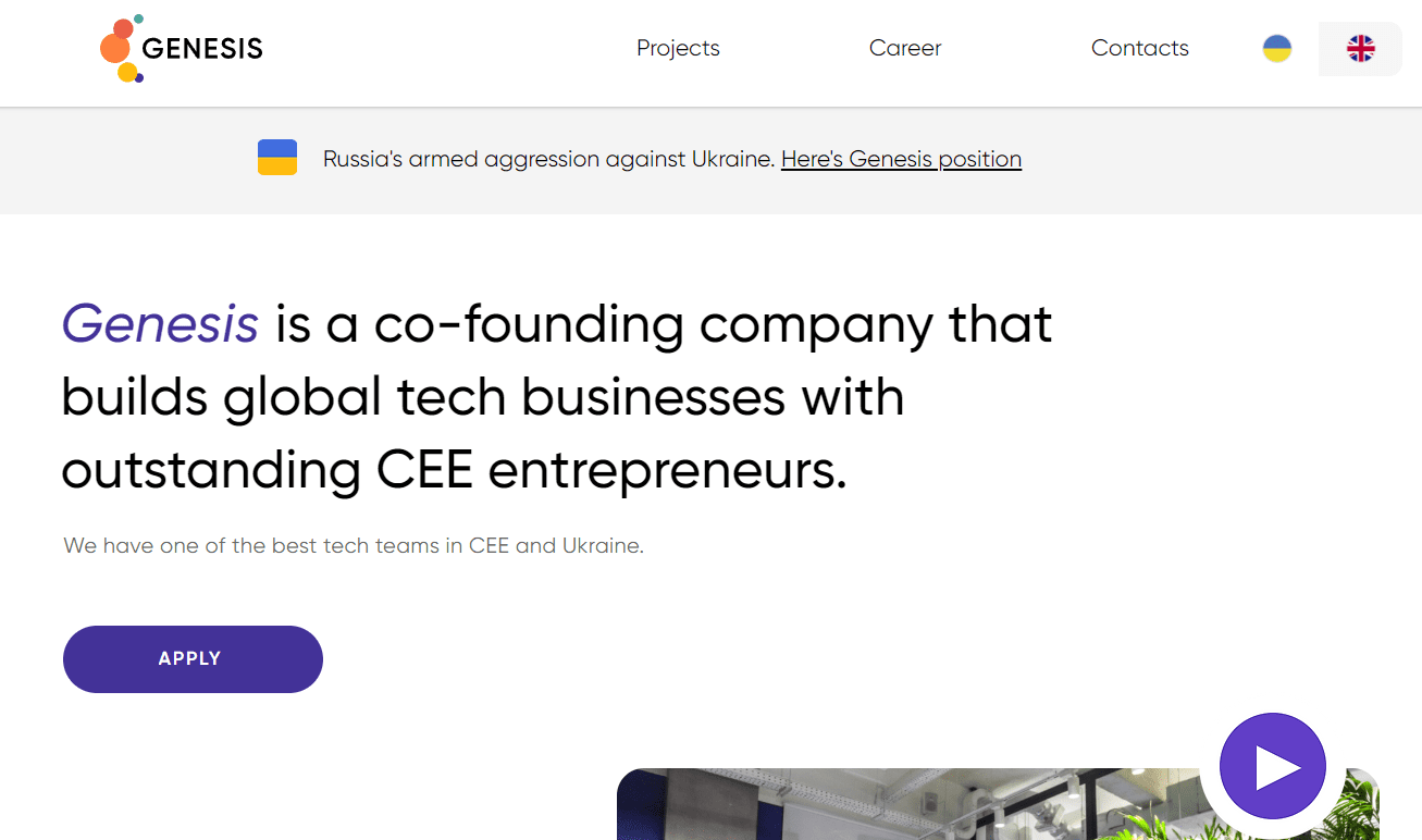 This solution is also popular and has some reasons behind it. It all comes down to individual preferences if you have high-quality monitors and proper lighting in the room. However, adjusting screen brightness for dark mode can be a hassle, especially with low-quality monitors like cheap laptops. Tilted screens can become unreadable, even more problematic with dark themes. It’s important to note that our eyes work best with dark text on a light background, and light text on a dark background can get blurry due to light’s impact on the lens.
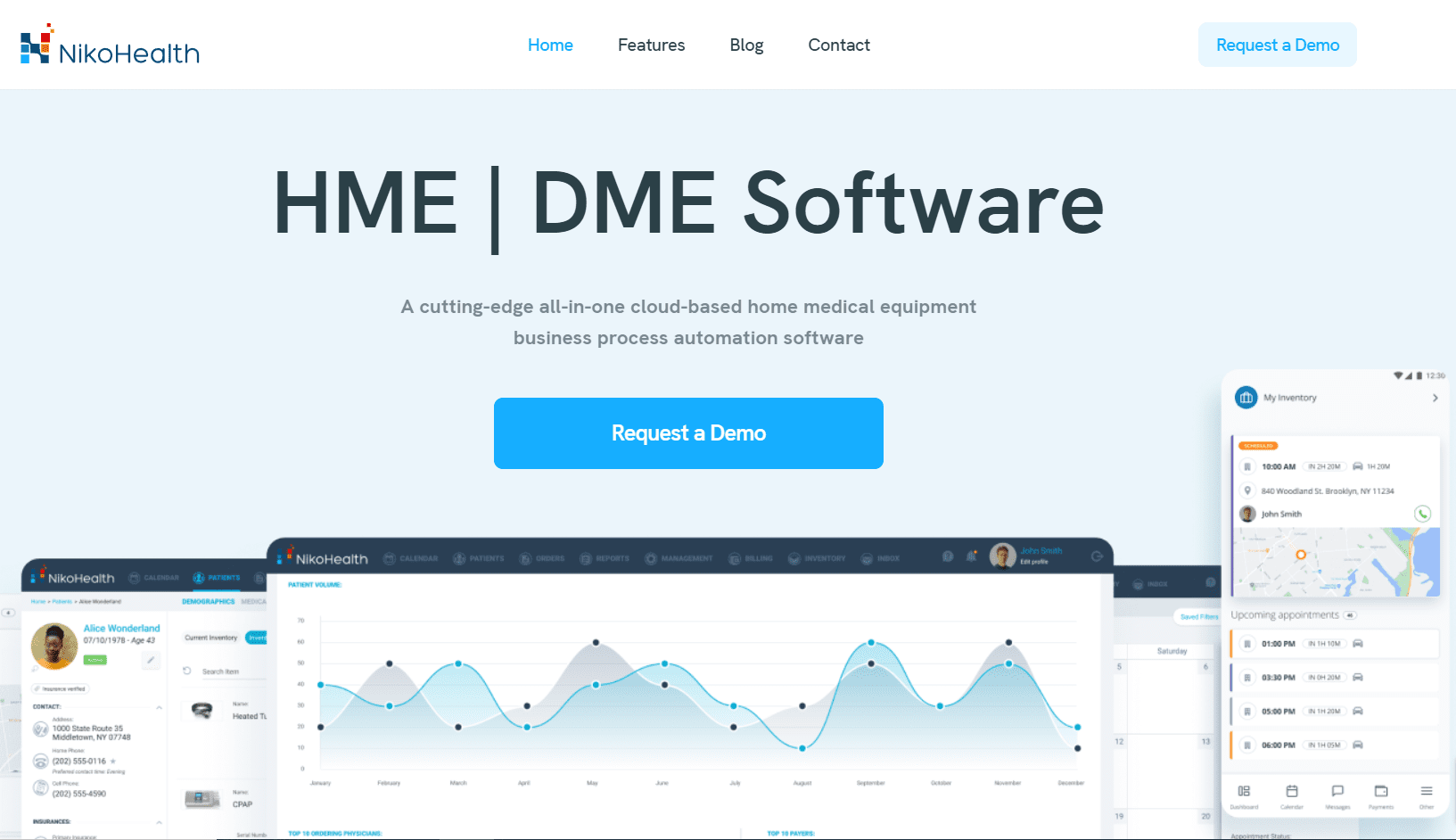 Blue buttons with CTAs are also quite common on SaaS websites. The blue color (#0000FF) is commonly associated with hyperlinks and is known for its ability to catch the eye. However, additional reasons exist to consider incorporating it into your button while drafting SaaS web design. You create a strong connection that enhances the overall message by aligning your call to action with your brand logo. If your brand’s primary color is blue, using it in your button design helps maintain consistency and reinforces brand recognition. And historically, many businesses use blue, while entertainment sites prefer bright logos and buttons.
Why settle for generic stock photos when you can showcase your unique style with custom illustrations? Capture your work in a picture and share it with the world. Stand out from the crowd and impress your clients with designs that are uniquely yours. With customized illustrations, the possibilities are endless, so let your creativity shine and make your SaaS web design work perfectly!
The world of customer service and marketing is undergoing a remarkable transformation with the emergence of conversational marketing techniques and advanced customer support solutions like live chat. In today’s fast-paced digital landscape, users have high expectations when it comes to receiving prompt and accurate answers to their queries. The concept of engaging in real-time conversations with prospects or utilizing chatbots has gained significant traction, particularly among B2B SaaS companies.
Support teams often serve as the driving force behind organizational improvements. They occupy a unique position at the heart of customer information, directly interacting with users and collecting valuable feedback. This feedback goes beyond mere bug reporting; it encompasses nuanced observations that recognize what works well while suggesting tests and enhancements to elevate the user experience. It is a weighty responsibility that can significantly influence the success of a business.
Want to create a successful SaaS website? It’s all about putting your clients first. Adopting a user-centric approach ensures that every element you include in your SaaS web design is valuable and relevant to your customers. So, next time you’re designing a website, put yourself in your client’s shoes. Will this feature truly benefit them and help guide them toward the sales funnel? Simplify and streamline your site for an optimal user experience. If you need assistance, you can hire our SaaS marketing agency to create value for your clients.
| Cookie | Duration | Description |
|---|---|---|
| cookielawinfo-checkbox-analytics | 11 months | This cookie is set by GDPR Cookie Consent plugin. The cookie is used to store the user consent for the cookies in the category "Analytics". |
| cookielawinfo-checkbox-functional | 11 months | The cookie is set by GDPR cookie consent to record the user consent for the cookies in the category "Functional". |
| cookielawinfo-checkbox-necessary | 11 months | This cookie is set by GDPR Cookie Consent plugin. The cookies is used to store the user consent for the cookies in the category "Necessary". |
| cookielawinfo-checkbox-others | 11 months | This cookie is set by GDPR Cookie Consent plugin. The cookie is used to store the user consent for the cookies in the category "Other. |
| cookielawinfo-checkbox-performance | 11 months | This cookie is set by GDPR Cookie Consent plugin. The cookie is used to store the user consent for the cookies in the category "Performance". |
| viewed_cookie_policy | 11 months | The cookie is set by the GDPR Cookie Consent plugin and is used to store whether or not user has consented to the use of cookies. It does not store any personal data. |